SCREEN NSW
Presenting NSW as the destination of choice for the Screen industry.
While working at Adrenalin Media, I led the UX phases of a project to completely redesign Screen NSW's website. We needed to showcase to an array of user groups why NSW was the best destination for their Screen endeavour.
INDUSTRY
Screen
MY ROLE
UX Designer
MY KEY ACTIVITIES
User interviews, user journeys, information architecture, wireframes, usability testing, full project team collaboration
THE CHALLENGE
A diverse group of users in a competitive landscape
Screen NSW fights for voice within the highly competitive international Screen industry. The existing website had not been updated in over a decade and was very difficult to use on desktop and effectively unusable on mobile devices.
Through research & discovery activities, including in-depth user interviews, competitor analysis and review of existing client research, it became apparent that the Screen NSW audience is comprised of a diverse audience with unique needs & challenges. We needed to design & build a new website that quickly captured user engagement and allowed users to efficiently find relevant information, such as discover available funding & incentives, explore locations, and browse recent productions.
THE APPROACH
Detailed user journeys were compiled to help inform website features and information architecture with our users at the core
To ensure we built a site that effectively addressed user needs and challenges, I completed user journeys for two key user groups - users based in NSW seeking funding and support for their Screen project and interstate/international users considering NSW as a filming location. By outlining the steps, actions, emotions, challenges and touchpoints in the user journeys, I was able to determine information that the site needed to provide to users and areas of opportunity to provide a seamless user experience.
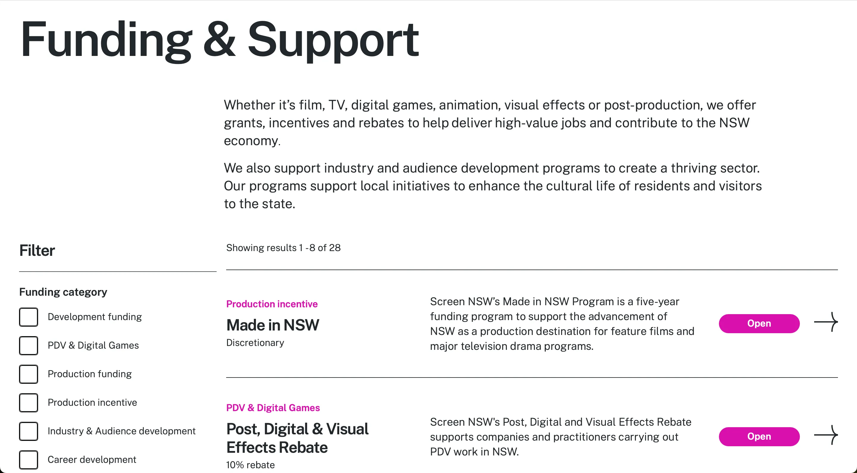
This helped to inform information architecture, the pages required on the site, and site navigation. Additionally, this foundation enabled me to outline in a feature roadmap the key functionality that would be required, such as homepage quick links, visually impactful feature tiles to promote timely content, and a filterable funding page complete with a snapshot of key information for each funding & support opportunity.
Rapid design iteration
The design was rapidly iterated at the wireframe stage to ensure the project effectively met both user and business goals. This process involved conducting usability testing on a mid-fidelity prototype, uncovering areas for improvement before the design progressed to the UI and development stages.
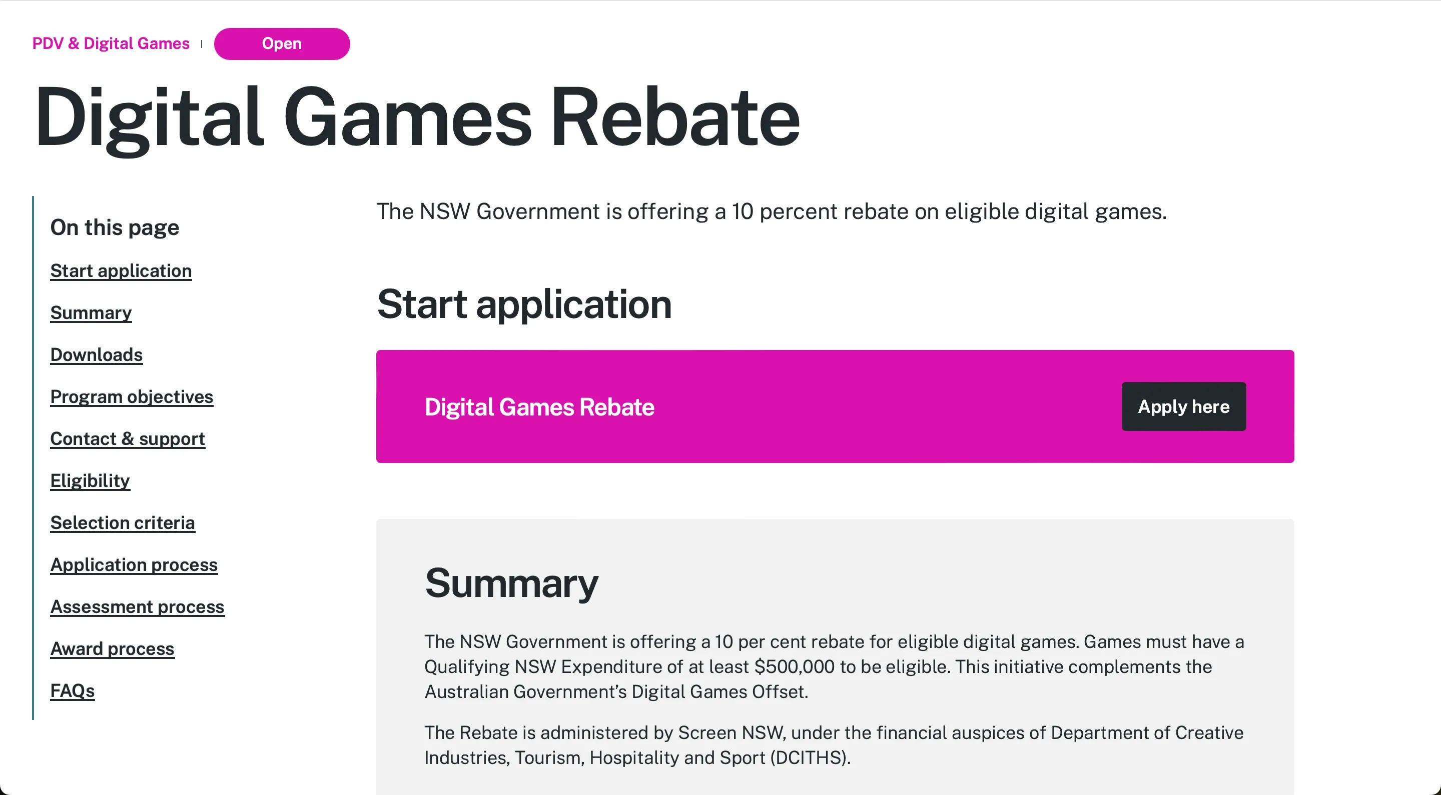
Refinements made post-usability testing included updating the site navigation to better align with user expectations, additional filtering options in the funding section and restructuring the funding detail pages. These pages were adjusted such that all funding pages had a clear status (e.g. ‘Open’ or ‘Closing soon’), content sections were arranged to start with what had been identified as the most critical information to users, and the pages all followed a consistent structure with required and optional sections specified in the backend to cater for a range of different types of funding and incentives.
Phased delivery to meet the SXSW Sydney deadline
To meet a critical deadline for South by Southwest Sydney, we released the site in two phases without compromising the long-term vision. I assisted with scope planning and prioritisation with product and engineering, defining the MVP, and ensuring deferred features had clear design tickets for Phase 2.
- Phase 1 — Event-ready MVP: I worked with the full product team to streamline scope, reducing planned pages and functionality to accelerate design and development. We prioritised the core funding experience and clear navigation, and deferred advanced key filters, the Resources section, and the “register your interest” form for upcoming funding rounds.
- Phase 2 — Full launch: Post-event, we completed the experience by reintroducing comprehensive filtering, launching the Resources hub, and adding the register-interest flow, aligning the product with the original roadmap.
THE SOLUTION
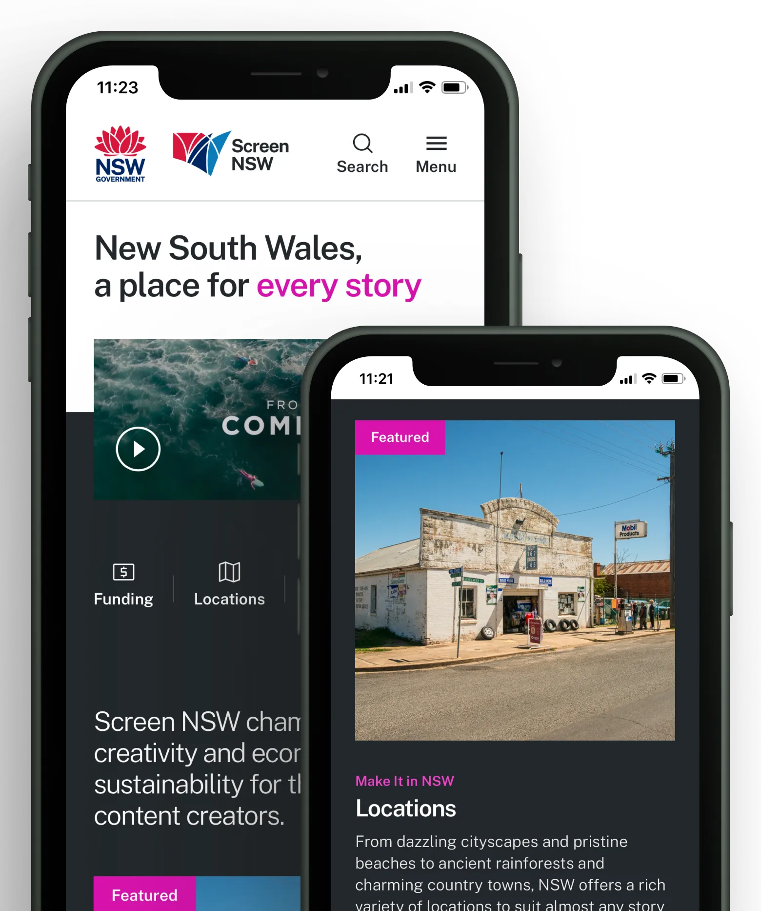
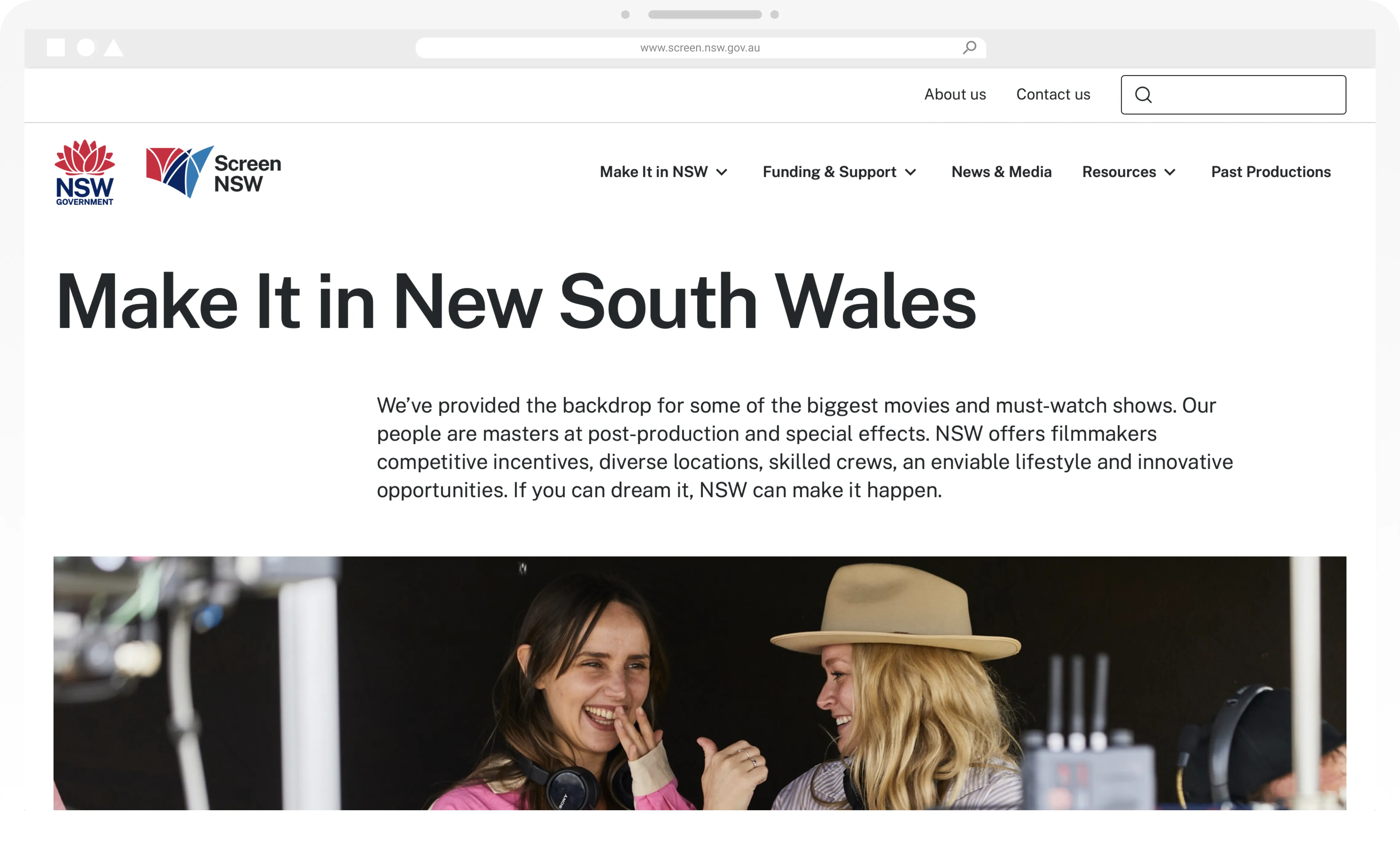
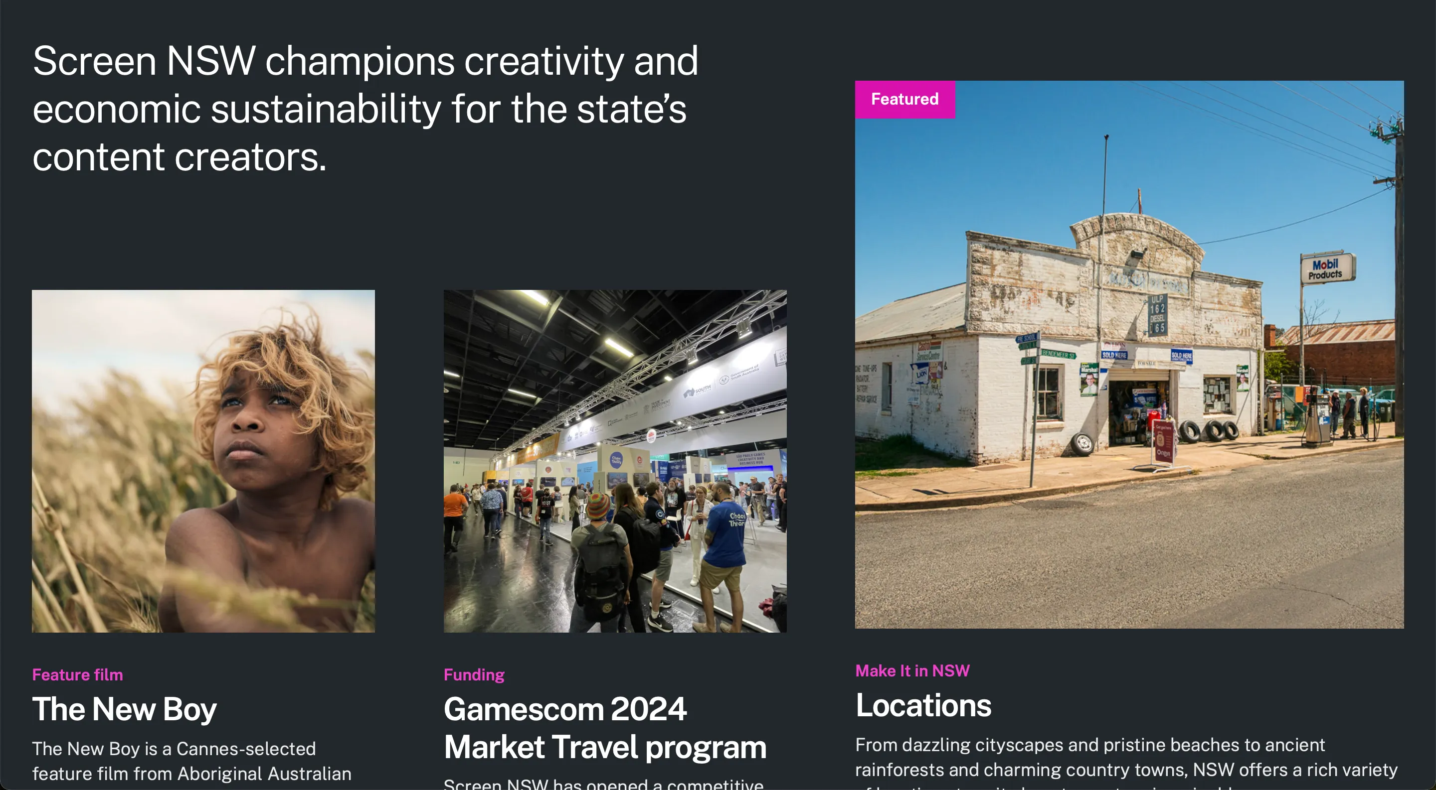
A visually stunning and easy to navigate solution
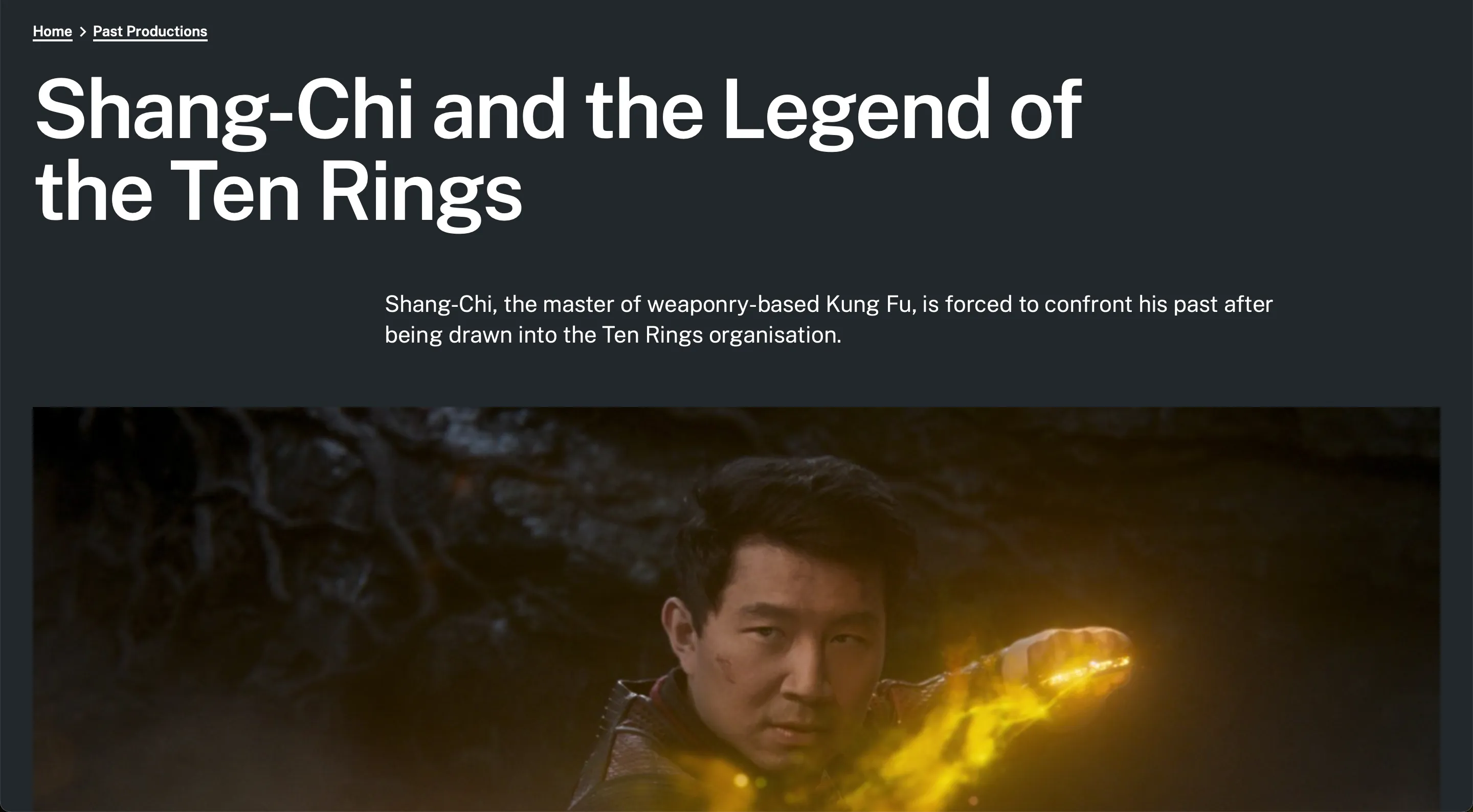
Through the collaboration of the entire project team, we produced a captivating website experience that meets the needs of Screen NSW’s diverse audience groups. Space was provided throughout the site’s design to hero stunning visuals in order to present NSW as the destination of choice for Screen projects. Clear navigation and site structure allows for easy site exploration and discoverability of relevant information. This is a site that will help Screen NSW stand out as a destination of choice for local, interstate and international Screen audiences.
OTHER WORK
Overhauling Mitsubishi's car configurator experience
I led the design for Mitsubishi Australia to rethink their car configurator experience, enabling customers to build, price & visualise their ideal car.
View case study →